When it comes to your digital marketing in today’s landscape, throwing up a website that just checks the boxes won’t cut it. If you’re reading this article, chances are that you might have a hunch that your website isn’t working as hard as it could be.
A website’s effectiveness can be measured by the conversions it generates:
- Is your website generating qualified new leads for your business?
- Is your website helping grow your email list?
- Is your website generating inquiries and call bookings?
- Is your website generating sales and revenue growth?
If not, it might be time for a strategic refresh.
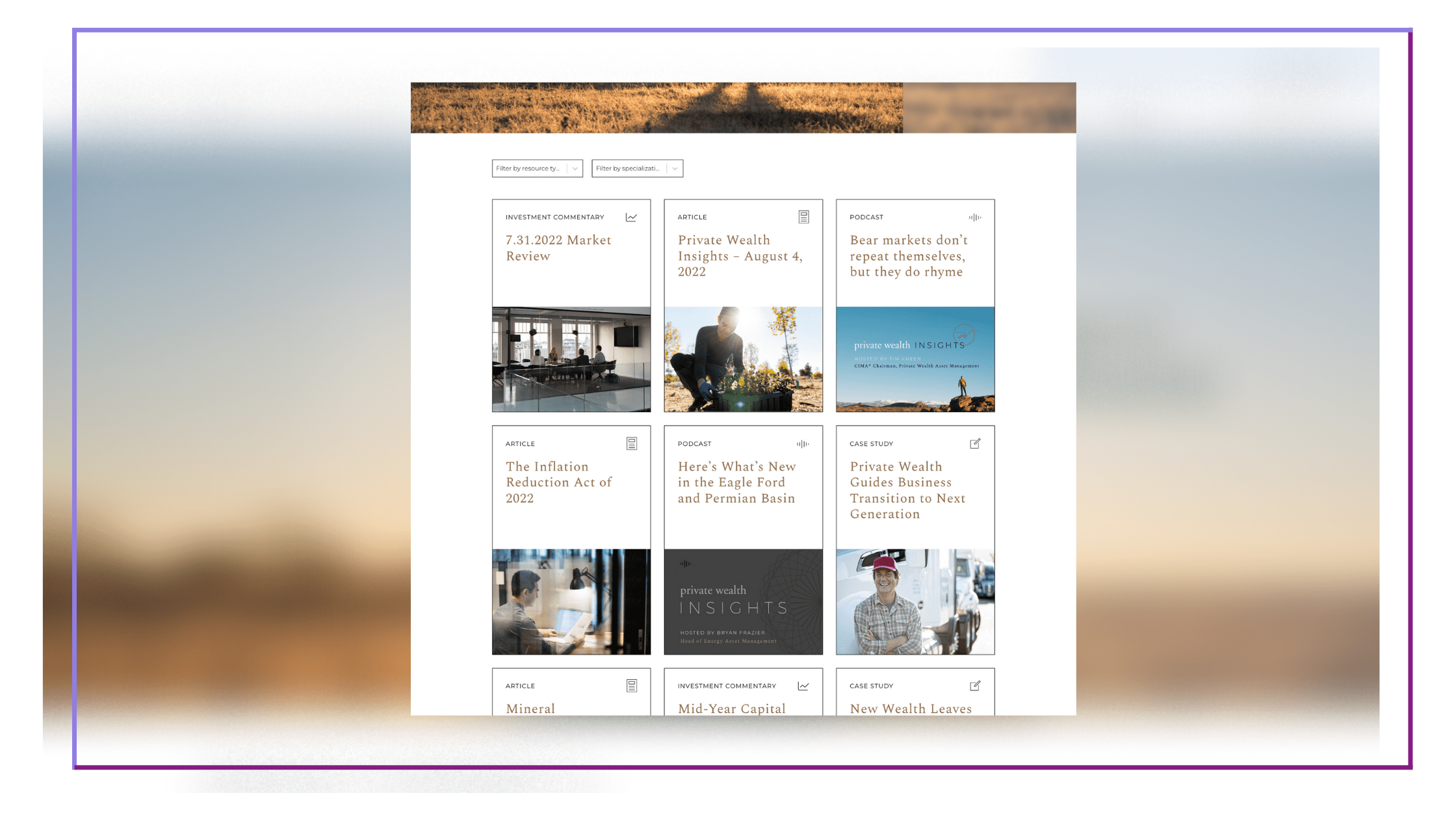
Here’s what high-converting websites do differently.
1. Guide the user through a journey
Mistake: Overloaded Site Navigation
Some of the biggest mistakes we see are overloaded site navigations. One-off pages get added over time, and end up in a drop-down menu that starts to feel a little like a junk drawer. Consequently, one of the biggest requests we see is a website that’s easy to navigate. Along with this, many websites have too many calls to action, not enough, or they aren’t strategically placed.
“Less than half of all the websites have a CTA that can be found in under three seconds.”
– Quick Sprout
How to Fix It: Streamline the User Experience
It’s time (and absolutely key) to streamline your navigation, and the user experience as a whole. Here, we’re focusing on your website architecture: navigation, page organization, and presence of call to actions.
Here’s what this looks like on your website:
- Top navigation items are limited to seven or less.
- Drop-down menus or mega menus are used to help organize page links.
- Non-essential menu links are placed in the footer. This always depends on the priorities of each company, but nonessential links can often include items like FAQ, Careers, Press, Become an Affiliate, etc. They’ll be easy to find for those who are looking, but they won’t clutter up the top navigation.
- Page sections appear in a natural order and flow as a unified story.
- A call to action is present in navigation, marquee, or both.
- Strong, clear calls to action are placed throughout pages. The best call to actions give the user an idea of what to expect on the other side. For example, “Download the Case Study” instead of “Click Here.”
- There are no dead ends. All pages end with a call to action that leads users to the natural next step.
“The easier you can make it for your visitor to find the right piece of information, the more likely it is that they will convert.”
– LinkedIn
2. Tell a clear, engaging story
Mistake: Confusing the User
As our good friend Donald Miller of StoryBrand says, “If you confuse, you’ll lose.” Many companies have an excellent product or service, but aren’t communicating clearly to their audience.
“Lack of clarity or relevance will hurt your conversion rate.”
– Verizon
How to Fix It: Clarify Your Messaging
StoryBrand also tells us that people don’t choose our products or services because they think it’s the best out there. They choose it because they have a problem and they believe our product or service will solve it.
How this translates on your website:
- Make it immediately clear what you do and who you’re for.
- Speak to your audience’s pain points.
- Speak to their goals and desires.
- Help them understand how you’ll help them get from where they are to where they want to go.
 3. Showcase why you’re different
Mistake: It’s Not Clear Why The User Should Choose You
In today’s online landscape, consumers have access to an endless selection of providers at the click of a mouse. It’s critical that you showcase what sets you apart and why they should choose you. Some companies haven’t fully tapped into what these differentiators are — or they might be common knowledge internally but they’re not being showcased effectively on the website.
How to Fix It: Showcase What Sets You Apart
There are likely numerous key differentiators for your brand, products, and services. Highlight them through a variety of methods that include copy, imagery, and more.
On your website, this can play out in the form of:
- Benefits & features unique to your product or service.
- Interesting stats and data points.
- Compelling case studies.
- Your company’s mission and vision.
- Photography that reflects your specific target market.
- An overview of your process to show the unique experience of working with you or using your product.
- Social mission mentions like Female Founder Collective, Cruelty-Free, Certified B Corporation, and more.
- Demo videos, screenshots, and more.
4. Anticipate and answer questions & objections
Mistake: Assuming Potential Buyers Will Ask Questions
Never assume your audience will reach out if they have questions. The moment a user has to work to find information is the moment they’ll take the path of least resistance and drop off. Don’t lose their interest by failing to address objections.
How to Fix It: Anticipate and Answer Questions and Objections
Answer your audience’s questions and challenge their objections to demonstrate that you fully understand their pain points and desires. Connect with them and show that you can lead them from Point A to Point B successfully.
Here’s how this can be done on your website:
- Create resources or blog posts to answer common questions.
- Include FAQ sections where appropriate to answer common questions.
- Create a how-it-works video or even a page devoted to explaining your product, service, process, or solution.
- Address objections through well-crafted case studies.
- Highlight any relevant guarantees or factors that reduce perceived risk.

5. Instill trust
Mistake: Thin Content
Most companies are doing a good job of covering their bases here, but we often see the most area for opportunity in content creation, such as case studies, resource articles, and even a bolstered About page.
How to Fix It: Beef Up Content to Show Expertise
Online scams and fraud schemes are alive and well and they’re getting better and better at appearing legitimate. It’s up to us to ease every qualm and assure our audience that we’ll deliver on our promises. There are several ways to increase trust.
On your website, this looks like:
- Making sure your SSL certificate is in place and working (this is the little lock icon by your URL in the web address bar).
- Including reviews and testimonials.
- Showing a company address and phone number.
- Displaying case studies that show the full process of working with you.
- Resource and/or blogs that convey experience and knowledge.
- FAQ sections that answer questions.
- Any relevant product or service guarantees.
- Ratings by third-party services like Google, TrustPilot, BBB, and more.
- Clearly linking to your policies.
- An About page that talks about your company’s history, leadership team, and includes photos.
When a consumer interacts with a product review, they are 58% more likely to convert.
– BigCommerce
 6. Show up as a thought leader through consistent, quality, and original content
Mistake: Inconsistent Content
The keys here are consistent, quality, and original. If your last resources were posted years ago, it’s probably doing more harm than good to your digital image. Users will wonder when you last updated the rest of your website as well and question the accuracy of its content. Also, while there are numerous content subscription services out there that you can copy and paste to share with your audience, it’s always going to feel one step removed. Plus, you risk being penalized by Google for duplicate content, and consequently hurting your SEO and web authority ranking.
How to Fix It: Consistent, Quality, and Original Content
Decide on a publishing schedule that your team can actually commit to and create a plan to produce it. Once a month is better than twice a week for a spurt of time and then nothing for months after that. Original content will always be best. It’ll provide additional value to your audience because you’re able to speak directly to their unique goals and challenges.
On your website, this looks like:
- Posting resource or blog articles consistently on a schedule that makes sense for your team.
- Creating high-quality case studies.
- Showcasing company-owned videos, audio, podcasts, and more.
- Delivering a top-notch lead magnet that provides additional value.
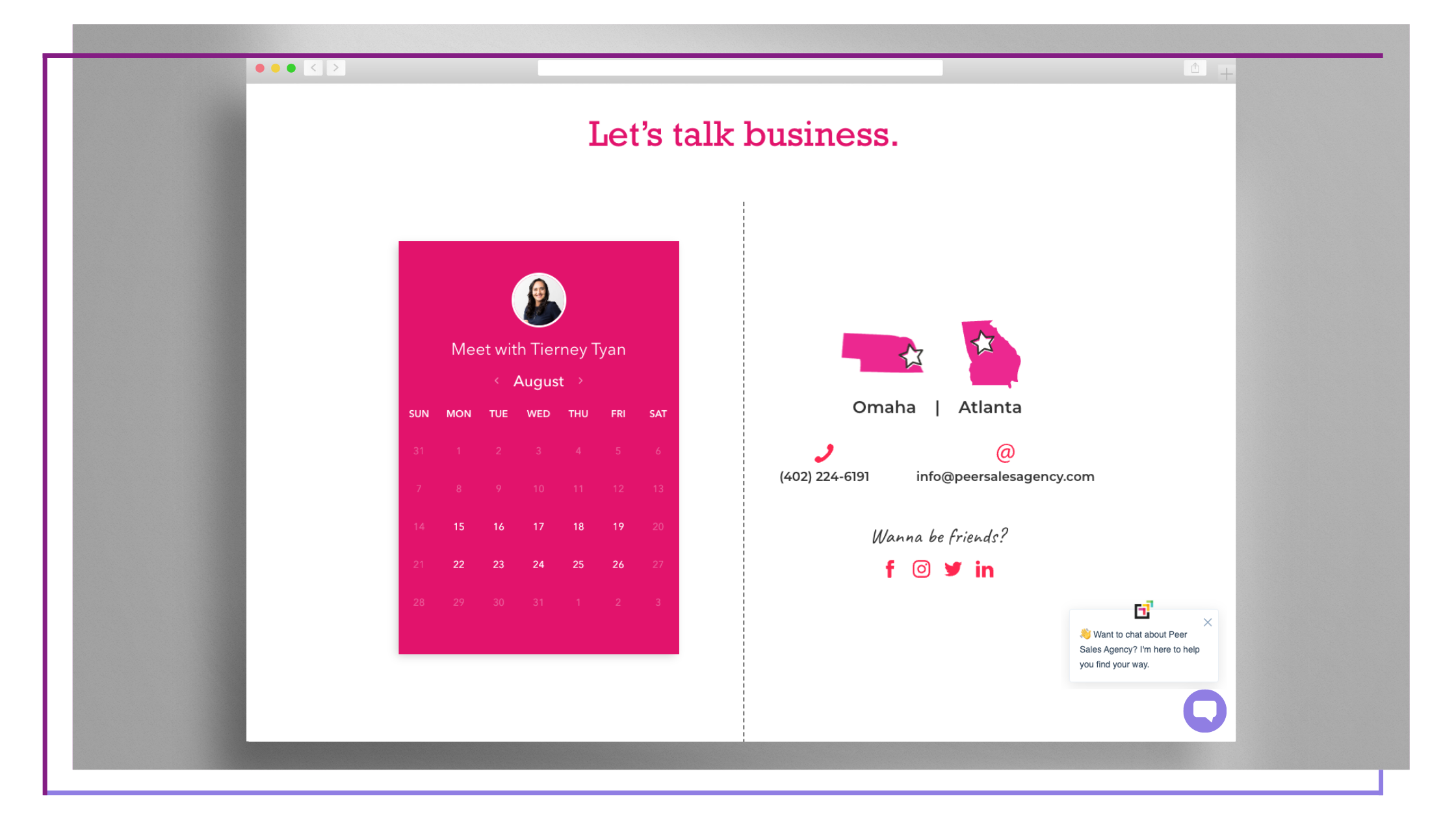
7. Make it easy for clients and customers to ask questions, buy, or book a call
Mistake: Barriers to Connect
If you aren’t utilizing a live chat widget and forms to engage, you’re not only missing out on opportunities to generate quality leads, you’re missing out on opportunities to streamline and automate your business.
How to Fix It: Make it Easy to Connect with Chat Widgets and Forms
It’s time to sign up for a service that can handle all of these requirements with ease. We use and love HubSpot.
Here’s what it looks like on your website:
- A convenient live chat widget that makes it easy for potential clients to ask questions.
- Calendar scheduling that allows people to conveniently schedule a call.
- Embedded forms that allow users to sign up and receive an lead magnet (and add them to your mailing list).
- Embedded contact forms that seamlessly integrate with your CRM.
- Embedded newsletter sign-up forms that allow people to opt-in to your communications.

8. Check the tech boxes
Mistake: Neglecting the Tech
We know that website tech is daunting and always changing, so it’s no surprise that it sometimes gets pushed to the side. However, avoiding these tasks can cost you big in terms of drop-offs, abandonment, and search result rankings — and consequently — leads and sales.
A one-second delay in page response can result in a 7% reduction in conversions.”
– Neil Patel
How to Fix It: Optimize Your Website
There are 4 areas we want to point out here: SEO optimization, fast load speed, mobile friendliness, and security.
Here’s what this looks like for your website:
- Assess target keywords and optimize all pages for these keywords.
- Submit site to Google for best ranking results.
- Optimize pages, content, images, and assets for fast loading.
- Tailor user experience for multiple device sizes, especially mobile.
- Protect your site and your visitors with security tools like SSL and Cloudflare.
“Having a nice mobile site can double conversions.”
–Neil Patel
How Peer Sales Agency Can Help?
Show us your current website and we’ll assess opportunities for improvement and growth. We can help you turn your website into a high-converting lead-generation tool.